It's Time for a New Logo
This post marks a momentous occasion—I have finally written more than 5 blog posts and I have enough content to where the home page will not show every post I've written. I'm still using this site as a place to mostly just document my projects but crossing the 5 posts threshold makes it feel like I have done a decent job of not giving up on it.
Anyway, today I'm writing briefly about a recent logo redesign I did which, with this post, I am now adding to my personal website.
The Past
I have gone through several attempts at a logo in the past. The first "real" one I can remember working on was this emulation of the old Adobe CS3-style logos I did for my name:

My second attempt hails from 2015 (I think) when made my first attempt at a personal website. I believe I had recently discovered a website that made free, open source fonts called "Moveable Type" and got inspired.
As you can see, not exactly building on the shoulders of giants here. Mostly I would just use these pictures as my avatars or my website favicon. Since I wasn't super comfortable with vector art at the time, I didn't have a good mental toolkit for going beyond "SB centered on a square".
The Present
For the record, I'm no vector art professional, but over the last few years I've gotten more comfortable busting out Affinity Designer for small projects. But I was really more stymied on the idea than I was on the tools.
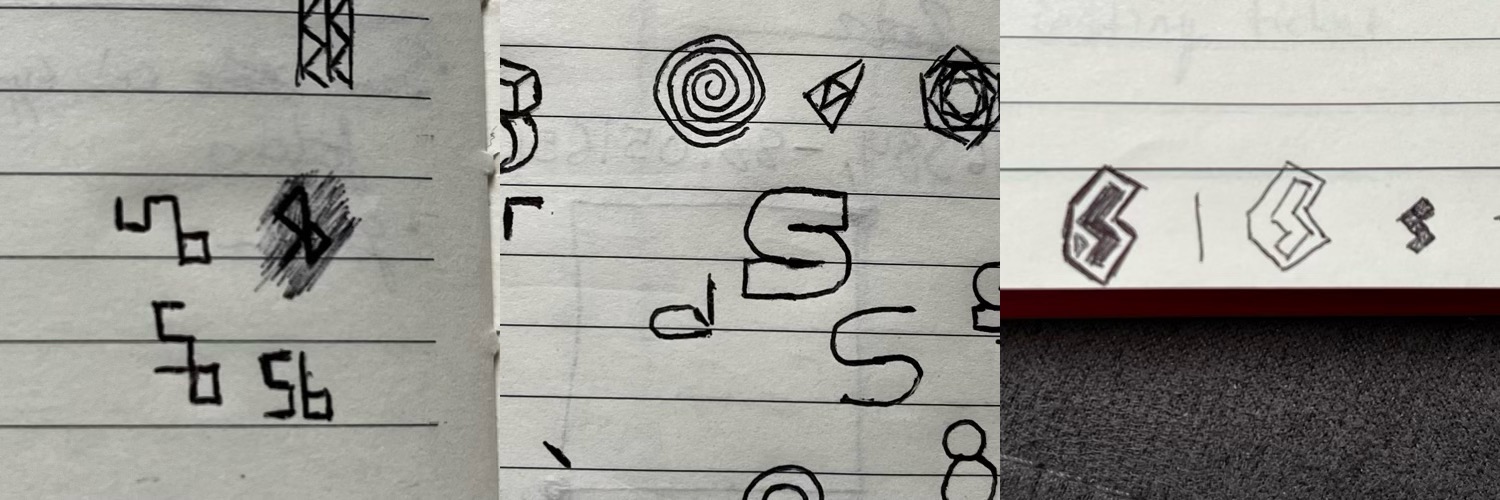
For a long time I've struggled to blend the S and the B into one coherent but cool shape. The margins of my notebooks are riddled with doodles trying to figure this problem out:
The epiphany came when I happened across the logo for Guild Esports, which looks like this:
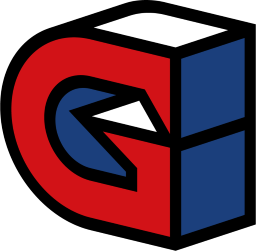
There were a couple things I liked about it. The geometry was simple and something I figured I could reproduce. I also enjoyed the "3D" illusion of the logo and wanted to replicate that. I also figured I could probably do away with the colors and just focus on the outline of the shape. Lastly, I decided I could stop trying to incorporate the B and just focus on a cool S.
At first I just tried to improvise/calculate all of the angles on a 2D canvas. That turned out to be a huge waste of time. It was just too hard to keep everything consistent.
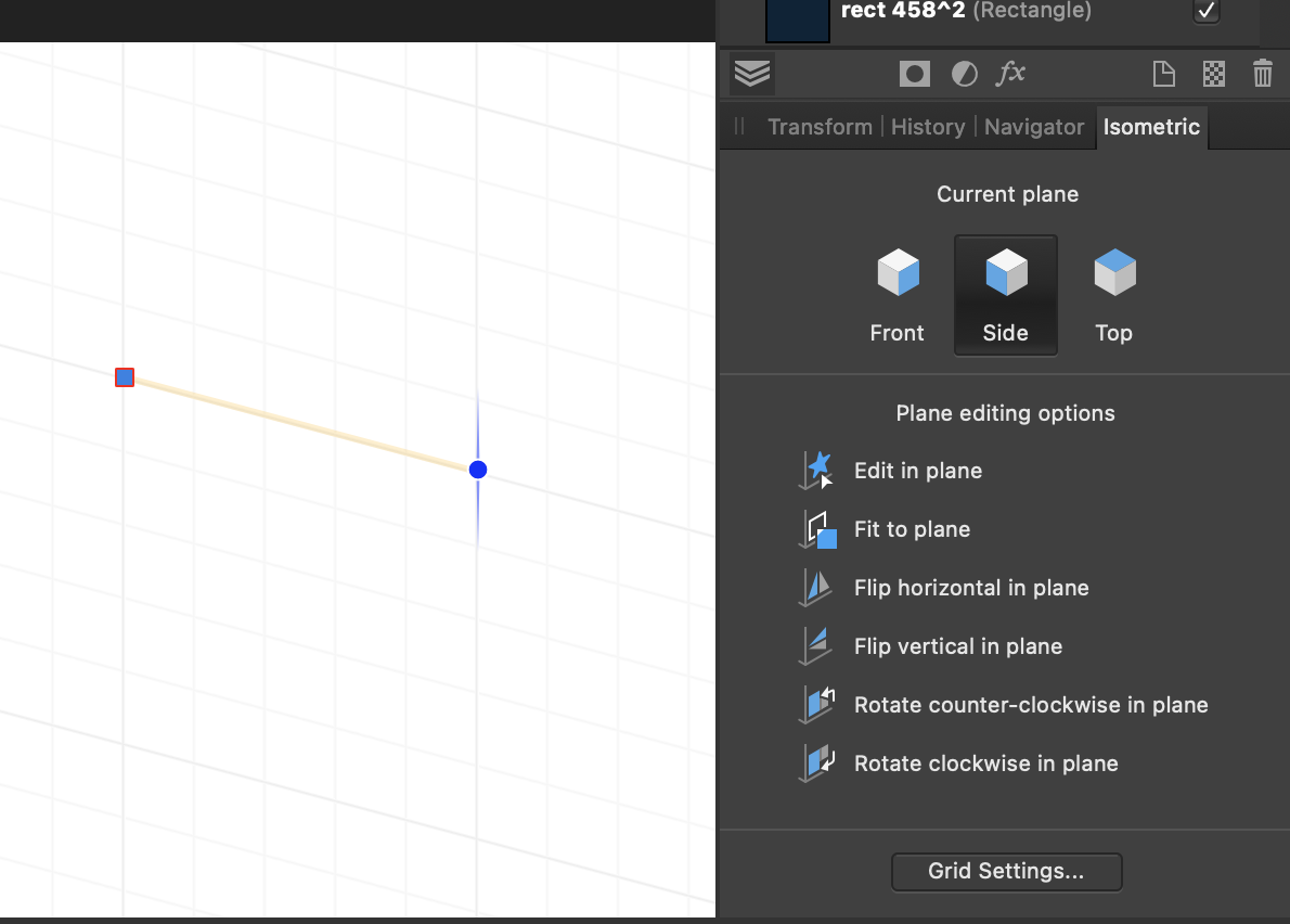
Eventually I discovered that Affinity Designer has an isometric mode. This allows you to change the display of the underlying grid to aid in designing "angled" scenes. There are various pre-configurations for this grid setup, the most popular being Isometric which tilts two of the axes by 30 degrees to give sort of a "top-down" feel. That seemed a bit excessive when I was trying it out so I went with dimetric which is the same but with only a 15 degree tilt. Once that was set up, I could use the isometric tools to adjust the grid to match the 3d face I was editing.
With all of that set up, I arrived at my first iteration of the logo.
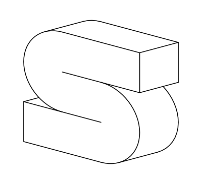
It wasn't horrible but didn't quite have the look I was going for. The main issue stemmed from trying to fit everything into a nice even grid. If you look at the front "S" face, you can sort of tell that I was trying to do it in an even 3x3 grid shape. While this was perfectly square straight on, in the dimetric view it ended up looking kind of weird. I didn't like how "wide" it made the S look.
Next I tried doing just about the same thing but with a 2x3 grid instead. This looked much better! After fattening up the lines a little bit and changing the colors to match my website's color scheme, I had a perfectly serviceable logo!
Takeaways
Not sure there's much to say about this one, but I enjoyed tinkering with some new design tools and I'm pretty happy with the result for now.
I'm hoping to post about a few more projects before the end of the year, so if you enjoyed this feel free to check back. Thanks for reading!