How I Made a RuneScape Quest Comparison Tool
Allow me to begin by describing how I fell victim to a severe malady known as New Project-itis™.
People suffering from New Project-itis™ experience three (3) stages of symptoms:
- You find a problem that seems relatively simple to solve
- You discover that there's a data source that would allow you do solve said problem
- You are now morally obligated to build that project
Research & Discovery
Jokes aside, a few months ago my brother and I were working through the numerous available quests in RuneScape 3 in tandem. However, since we were trying to do them together, it was difficult to figure out which quests we were both eligible to do. That is, quests that we could do together needed to meet multiple requirements:
- Neither of us had already completed the quest
- We both had met all of the skill/quest/misc prerequisites
- The quest was short enough that we could knock it out in a reasonable time frame
I thought about the problem a little more, and realized that the RuneScape Wiki uses a handful of APIs to dynamically load player data. This makes the wiki extremely useful because you can see all of the game's features in the context of your player's capabilities. One example of this that stood out to me was the List of quests page that shows which quests you have and haven't done.
As I was wondering how that worked, I came across a wiki page that literally gave me everything I needed: the API reference page. From that I found the /quests endpoint that you can send a GET request to like this:
https://apps.runescape.com/runemetrics/quests?user=USERNAME_HERE
...which gives us a response like this:
{
  "quests": [
    // One object for every quest, with status/difficult/eligibility/etc for each
    {
      "title": "Horror from the Deep",
      "status": "NOT_STARTED",
      "difficulty": 2,
      "members": true,
      "questPoints": 2,
      "userEligible": true
    },
    ...
  ],
  "loggedIn": "false"
}
And there it is, all the data I'd need to find quests that two users both need to complete. The idea seemed interesting enough so I decided to make it my first project of the year! I call it Quest Compare and here's a what it looks like:
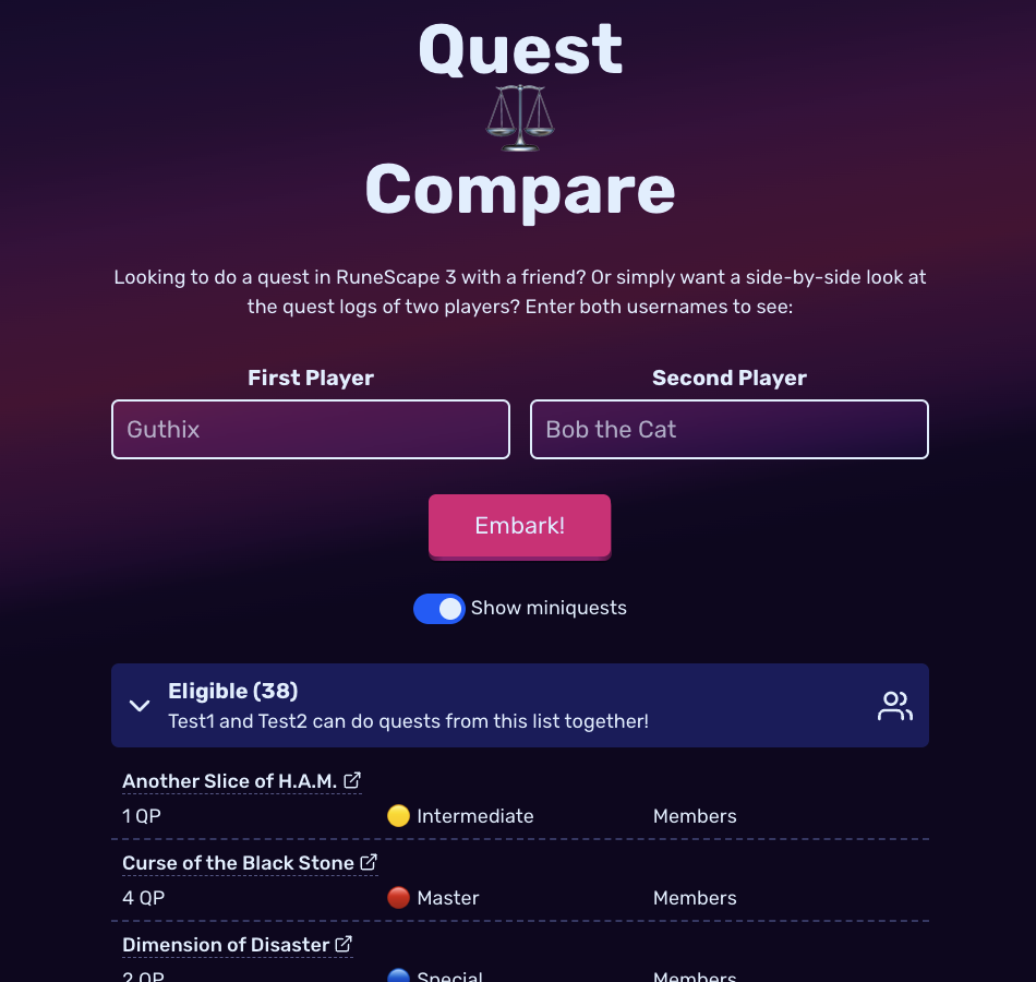
💡Hint: if you don't have any usernames handy, go to the middle of the RuneScape Hiscores somewhere and try a few of the usernames you see there. You may have to try a couple before you get a pair that have their data publicly available to the API.
Construction
I didn't try any thing crazy or new to build the site. Instead, I wanted to see if I could leverage the same stack I used to build my personal website to quickly get it off the ground.
Turns out, very quickly. Here's the core of the stack:
- Next.js
- React
- styled-components
- deployed to Vercel
In fact, it's a lot simpler than my personal site. Since I didn't need to handle multiple pages or blog posts, I could skip the MDX integration and just focus on the landing page.
The most straightforward work came at the beginning. First, I focused on getting a Next.js API Route working to fetch all of the quote data. This served three purposes:
- The RuneScape API I'm using has a CORS policy that prevents me from fetching directly on the web page without a proxy (the API route sort of serves as that proxy)
- Fetching both users' quest data in parallel
- Building the list of commonalities between both users' quest lists and returning it all to the frontend
The algorithm I wrote takes both quests lists and divides them into 5 types:
- Neither: Both players are eligible to start the quest (this is the main group I was interested in!)
- Started: Both players are eligible but one or both have started the quest already
- One Completed: One player has done the quest, the other has not
- Completed: Both players have done the quest
- Ineligible: One or both players have not met the quest requirements
After that, the hard work was done. I slapped a form on the web page to take two username inputs and hit the API, then after receiving the response dumped all that data into a couple of <details/> elements.
And presto! The core functionality was there but now it was time to make this thing ✨shine✨.
Feature Creep
I like to use projects like these to experiment with new CSS properties. The first item of business was the gradient I have towards the top of the page. I wanted it to be relatively simple and have one style work across mobile/desktop browsers. I experimented with radial and linear gradients and different colors and orientations. My original idea was to have the gradient be fixed in the background and let the inputs and other elements have a slight backdrop-filter on them to change color slightly as they passed over the gradient's colors. Unfortunately, mobile support for that proved iffy and I dropped that plan.
Ultimately, I grew pretty tired of trying to achieve the perfect color combinations and just settled with what I had. But there were plenty of other areas to spend too much time embellishing on so here's yet another bulleted list:
- The Embark Button - I followed Josh Comeau's excellent tutorial for building a fun-to-use button complete with animations and interesting accessibility considerations.
- The Miniquest Toggle - Somehow I had never built a CSS toggle component before, and there were some excellent examples in this article from CSS Tricks.
- The Loading Spinner - Another component I'd somehow dodged up until now. There are so many different ways to do this but I found Super Simple CSS Spinner by Thomas Mandelid on codepen that I liked and adapted to my needs.
- The Icons - In the past I usually have gone with FontAwesome but I decided to switch it up and try out Feather Icons instead. It went alright, but found myself having to adjust how they appeared vertically amongst my text. Maybe there's an easy solve for that but I just adjusted the vertical position slightly as needed.
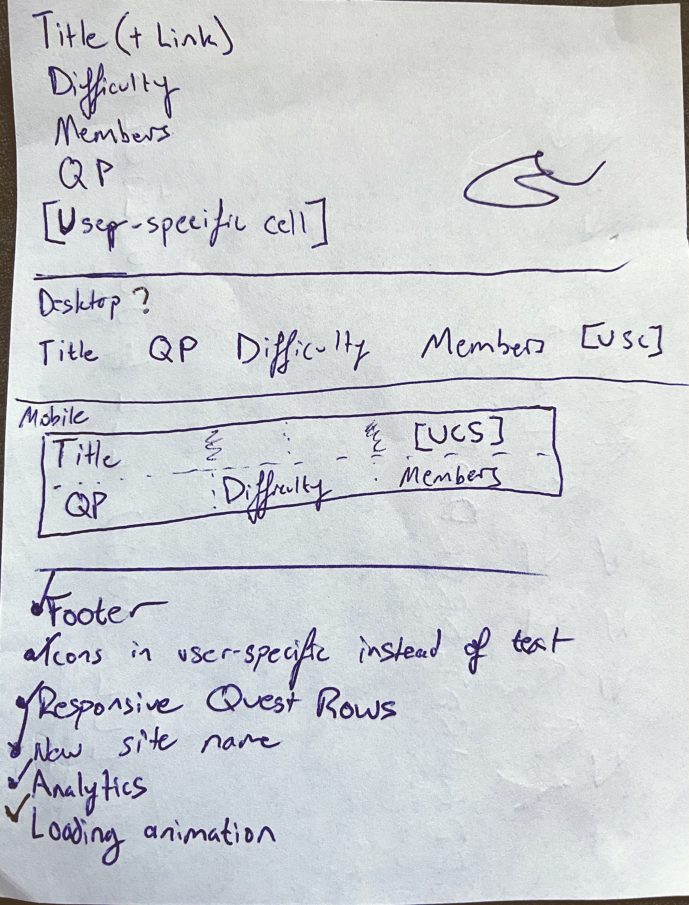
- The Grid - I used CSS grid for the overall site scaffolding and also for each individual quest row. It took me a while to decide on the best way to display the data and how to collapse it on mobile, but I'm pretty happy with what I landed on.
It sounds pretty straightforward when I arrange things in bullet points like this, but this project in particular took me a long time to finish that last 10%. It seemed like every time I thought I was done, there was one more small part of the app I wanted to embellish. At some point I had to decide it was finally ready to ship.
"Marketing"
At last the time came to share this thing with the world. I made sure I had custom events set up on GoatCounter so I could see how many times people tried to compare quests. I also hooked up CountAPI just to get a second opinion on the total number of times the Embark button was clicked over this app's lifetime.
Obviously, I shared it with the "original user story", my brother. I also shared it with a few friends that play RuneScape. The real traction came when I posted it on reddit.
Over the first 48 hours or so, over 150 people tried out the website! According to reddit over 25k people saw the post as well. The feedback I got was very promising, and people had some good ideas for future improvements. I even got some explanations on interesting bugs I'd seen with the API!
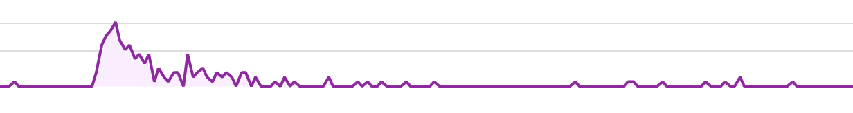
All said, I was pretty happy with the results! Naturally usage has died off a ton since the beginning, but it's not something people will need to use every day. Mostly I just wanted to get it out there in the world in case someone other than me would find it useful.
Final Takeaways
Time for some retrospection. First off, I'm still pretty happy with this development stack. It has worked well for my personal site, and translated very well to Quest Compare. I was also able to use a few more Next.js features like API Routes that I don't leverage much on my personal site.
That said, I think for my next project I should try something new to broaden my horizons. Remix has been gaining traction and has some interesting ideas, and there's other frontend tech like Svelte, Vue, and Web Components that I could potentially explore.
Lastly, my projects tend to gravitate towards a fairly homogenous color scheme, and I'd like to give some other colors a chance next time 😅
Thanks for reading!